What is a landing page?
Definition: a landing page is a page designed to turn a visit into a specific action: booking a demo, downloading a guide or requesting a quote. Its title echoes the promise that attracted the visitor; the rest helps them decide.
A homepage presents several paths. A landing page organises the journey around a single next step. It can perfectly well be part of your existing site.
Imagine an ad for an e-commerce website audit. If the click leads to a page presenting all your services, the visitor has to find the offer again. On a dedicated page, they immediately see the audit, what it includes and how to request it.
Google Ads specifically looks at the relevance of the information and the expectations set by the ad in its definition of landing page experience.
“Is this for me?”
A specific need and benefit.“Can I believe it?”
A demonstration, an example, a verifiable result.“What happens next?”
A button that clearly states what comes next.Choose the action before you design the page
The right format depends on what your visitor is ready to do. Someone trying to understand their problem doesn’t have the same need as someone already comparing providers.
| Their need | Your proposal | The action to take |
|---|---|---|
| Understand a topic | A guide or a webinar | Download or sign up |
| Check whether a tool is the right fit | A targeted demo | Book a demo |
| Move a project forward | A scoping conversation | Request a quote |
| Identify priorities | A diagnostic or a quiz | Get an assessment |
Converting and qualifying are two different goals. Getting an email address creates a contact. Knowing their project, timeline or need helps decide what comes next. Every extra question should therefore serve a purpose: preparing a reply, tailoring advice or directing the contact.
5 examples. 5 ways to move the visitor forward.
For each example, we’ll start from what the visitor is looking for, look at the visible choices, then see how to adapt them to another offer.
Screenshots taken on 16 September 2026. The analysis covers the pages as observed; the suggested improvements are ideas to test, without access to their conversion data.
Brevo: requesting a demo while qualifying the project.
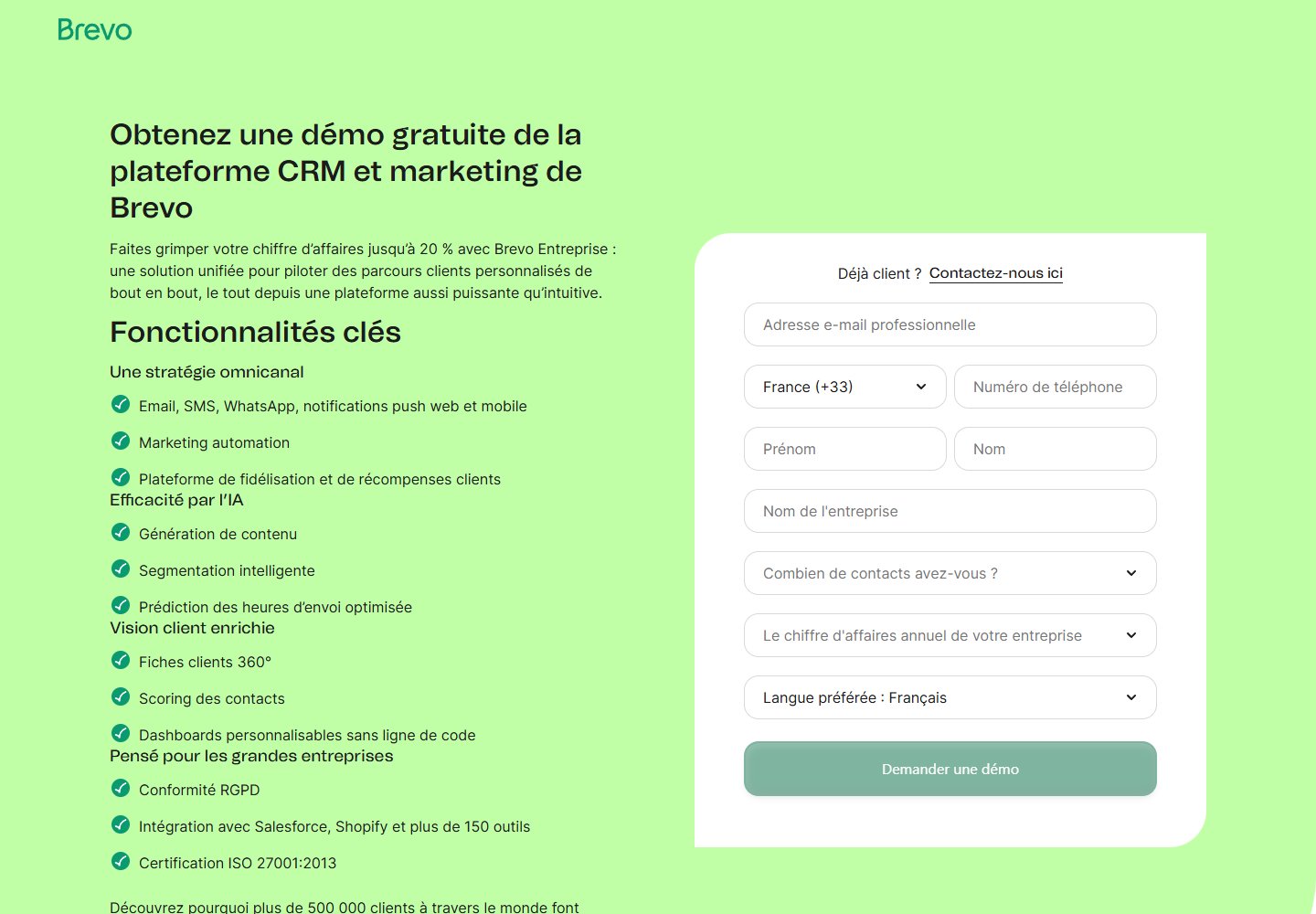
This page presents Brevo’s Enterprise offer, a marketing and CRM platform. The goal is to get a demo request. The questions about the company show that the form is also preparing a sales conversation.
 Enlarge the screenshot
A promise and a journey that line up
The title announces a free demo. The visitor knows what they’re asking for: a conversation to discover the platform. The form placed next to the features lets them read the offer while seeing the effort needed to move forward.
The list of features gives useful reference points to someone already comparing solutions: available channels, automation, integrations. Someone new to the subject, on the other hand, has to translate those features into benefits for their own business.
What we’d adapt at Brevo
An introduction built around a specific use case, placed before the list of features, would be worth testing. For an e-commerce-focused campaign, for example: showing how to connect messages sent after an order.
The questions about contact volume and revenue can help prepare the demo. Before reusing this form, work out which answers your team actually needs for the first conversation.
To apply: the level of qualification should match the commitment being asked for. A sales demo and a self-serve trial don’t necessarily need the same information.
Livestorm: making access to the replay obvious.
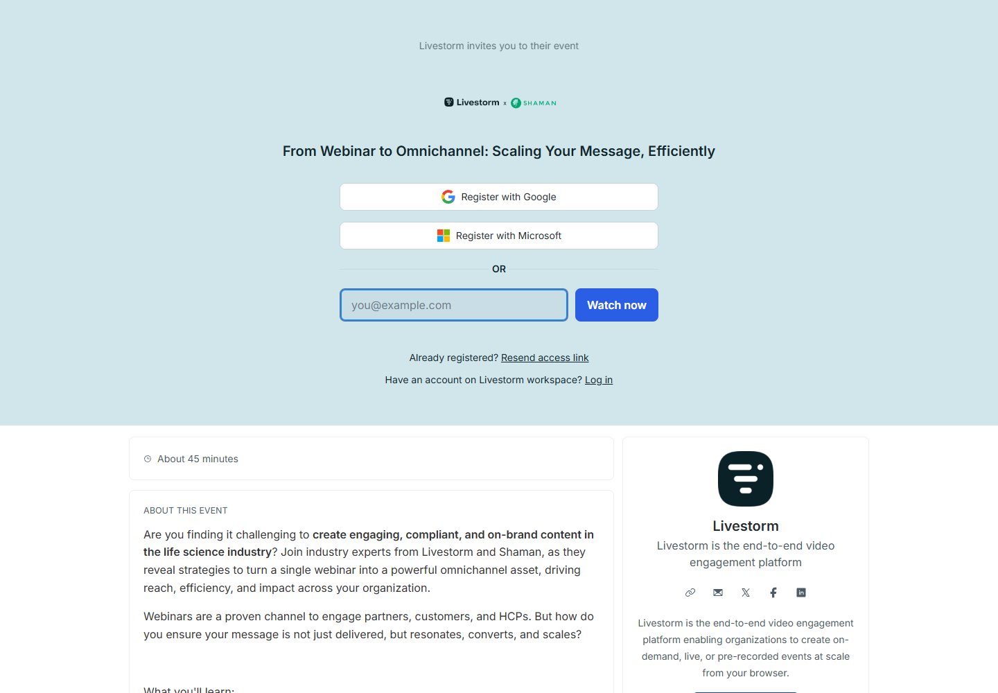
Here Livestorm offers a webinar on reusing content across several channels. The page in question gives access to a replay: the visitor comes looking for something to watch, rather than a sales meeting.
 Enlarge the screenshot
An easy first step to understand
The title introduces the topic, then the form offers an email sign-up or one with Google and Microsoft. The stated duration just below lets visitors judge how much time the content will take.
Not showing a long form up front keeps the initial effort low. The different sign-up options lead to the same content: they change the method of access, not the page’s goal.
What we’d adapt at Livestorm
The detailed agenda comes after the form. For an audience who already knows the event, that shortcut can be convenient. For a visit coming from a discovery ad, three concrete takeaways placed near the title would change how the page reads.
For example: identifying which clips to reuse, choosing channels and planning distribution. Those takeaways would obviously need to match the webinar’s actual content. For a live session, the date and time zone would replace the logic of immediate access.
To apply: explain what visitors will learn before asking them to sign up, especially when they’re discovering your expertise for the first time.
HubSpot: giving digital content a tangible shape.
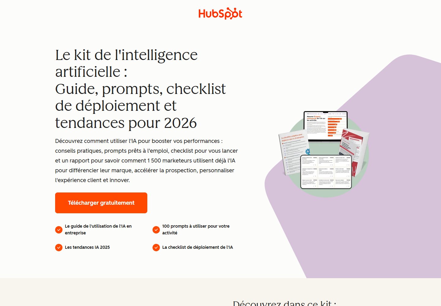
This landing page offers a kit on artificial intelligence. The download is the main action. The first screen therefore needs to explain what the resource contains and give a reason to keep reading.
 Enlarge the screenshot
The content becomes visible
The illustration shows several documents across different formats. It sits alongside a list of deliverables: the visitor can picture what they’ll receive. The orange button stands out against the light background and signals a free download.
This combination answers two different questions: “What will I get?” and “How do I access it?”. Here the visual carries information about the product on offer, beyond its decorative role.
What we’d adapt at HubSpot
The title and paragraph stack up several benefits. One main promise followed by three deliverables would make the first read faster. The details could stay further down, for those who want to check the content.
The screenshot also shows two different years. That’s worth checking whenever the page is updated: an inconsistent date can leave the reader unsure how current the document they’re about to request really is.
To apply: for your guide, show a real inside page and explain which question it helps answer.
WebFX: showing what happens after the quote request.
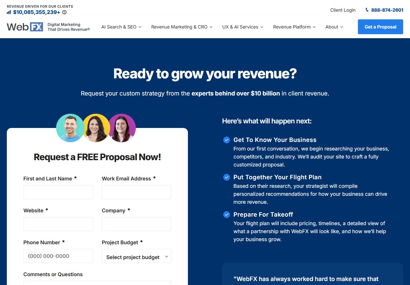
WebFX invites businesses to request a marketing services proposal. The form collects, among other things, the website, contact details and the project’s budget. Alongside it, the page explains the steps taken to prepare the offer.
 Enlarge the screenshot
What happens next is made explicit
The visitor can read how the agency plans to study their business, prepare recommendations and present its proposal. That gives the quote request concrete substance: the click opens an identifiable process.
The portraits above the form show real people. They support the process, but they don’t replace evidence of results. To assess a service, a comparable case study remains different information from a simple team photo.
What we’d adapt at WebFX
The form asks for significant effort before any conversation even happens. For a complex service, those answers can be useful. For an exploratory first contact, a shorter first step followed by a more detailed scoping call would work better.
The budget is asked for explicitly, which avoids having to guess it from the visitor’s profile. If you reuse this idea, offer an option for when the budget isn’t set yet.
To apply: replace “Contact us” with a precise explanation of the next conversation, its purpose and what to prepare.
Website Grader: making the diagnostic the entry offer.
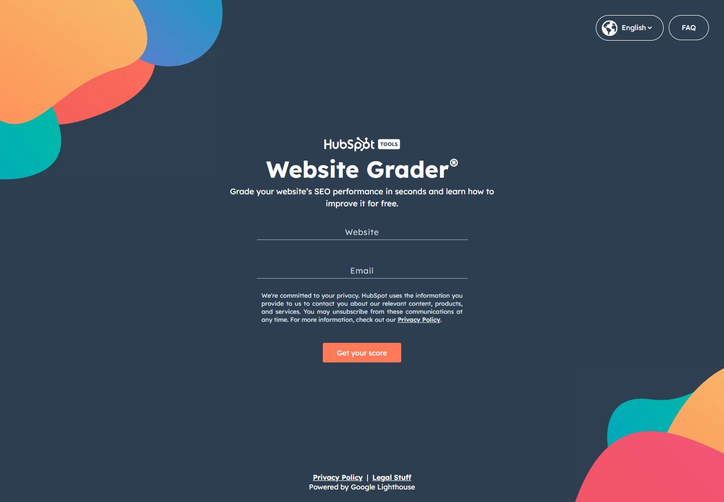
Website Grader, from HubSpot, invites you to evaluate a website. The first screen asks for a URL and an email address. It’s a technical diagnostic, different from the educational questionnaire offered further down this article.
 Enlarge the screenshot
The expected result carries the message
The visitor doesn’t start by reading a catalogue of services. The page invites them to find out where their own site stands, and the first screen delivers on that promise straight away.
The two fields play distinct roles: the URL identifies the site to analyse, while the email identifies a contact. The note under the form explains how the information provided will be used for marketing.
What we’d adapt on Website Grader
For our own diagnostic, a preview of the assessment would come first: the areas evaluated and a sample recommendation. That would let the visitor judge the value of the result before handing over their details.
A score alone doesn’t say what to do. If you choose this format, plan advice tied to the answers or the metrics, then a suitable next step. Our demo applies this logic without collecting any contact details.
To apply: design a useful assessment first. The form and the sales pitch come afterwards, in support of that value.
Try our quiz, no contact details needed ↓Build your landing page, block by block.
On the website creation projects we carry out in French-speaking Switzerland, a useful landing page always starts with the same three things: an audience, an offer and an action. Take the principles from these examples, then write a first version. Here is a structure you can use for a demo, a guide or a service.
A promise that’s easy to understand
“Help [audience] achieve [result] with [offer].” Then specify what’s included. Avoid benefits so broad they could describe any competitor.
Proof that answers the doubt
Show an interface for software, an excerpt for a guide, a comparable case for a service. Relevant proof answers “Is this right for my need?”.
A process with no surprises
Describe the whole process: immediate access, choosing a slot or a call back, and who gets in touch. Only state a timeframe or deadline if you can actually meet it.
A form that fits the ask
To receive a guide, the budget generally doesn’t help deliver the content. To prepare a quote, the project’s scope can be essential. Link every field to its purpose.
A button that names what comes next
“Get the guide” or “Choose my slot” describes what the click does. You can repeat this button on a long page while keeping the same main action.
Check what the page really delivers
Track the completed action, not just clicks on the button: that’s the job of your measurement tool. 20 forms submitted out of 1,000 visits give a 2% conversion rate in this made-up example. But if only two contacts actually match the offer, the volume doesn’t tell the whole story. Also look at how relevant the enquiries are and how many meetings they lead to.
Before changing the design, find where the journey stalls: a misunderstood promise, an abandoned form or off-target enquiries. Then test one precise change, on comparable visitors.
The interactive variant: assess, then guide.
A quiz is useful when the advice depends on the visitor’s answers. A simple download doesn’t need one. Unlike Website Grader’s technical diagnostic, the template below relies on self-reported practices: it helps you think through your page.
Create interest
A question that speaks to the visitor: “Is your [project] ready for [result]?” State what they’ll learn.
Understand
10 questions on their practices, then 5 on their context. Keep the assessment separate from sales qualification.
Guide
Three tailored pieces of advice. Then offer a conversation, a workshop or a resource depending on the need expressed.
The demo below applies this structure without asking for any contact details. The full template, the questions and the checklist are available just after it, to copy or download.
Understanding the score and its limits
In this exercise, “yes” is worth 2 points, “partly” 1, “no” or “don’t know” 0. The total for the ten questions is scaled to 100. The five context questions don’t affect the score. The three areas are normalised separately.
This assessment describes self-reported practices: it doesn’t predict a conversion rate. “Don’t know” flags a point worth checking. A preference for one type of support isn’t enough to know the budget.
Prepare a project brief, explore website creation or connect your page to a Google Ads campaign.