
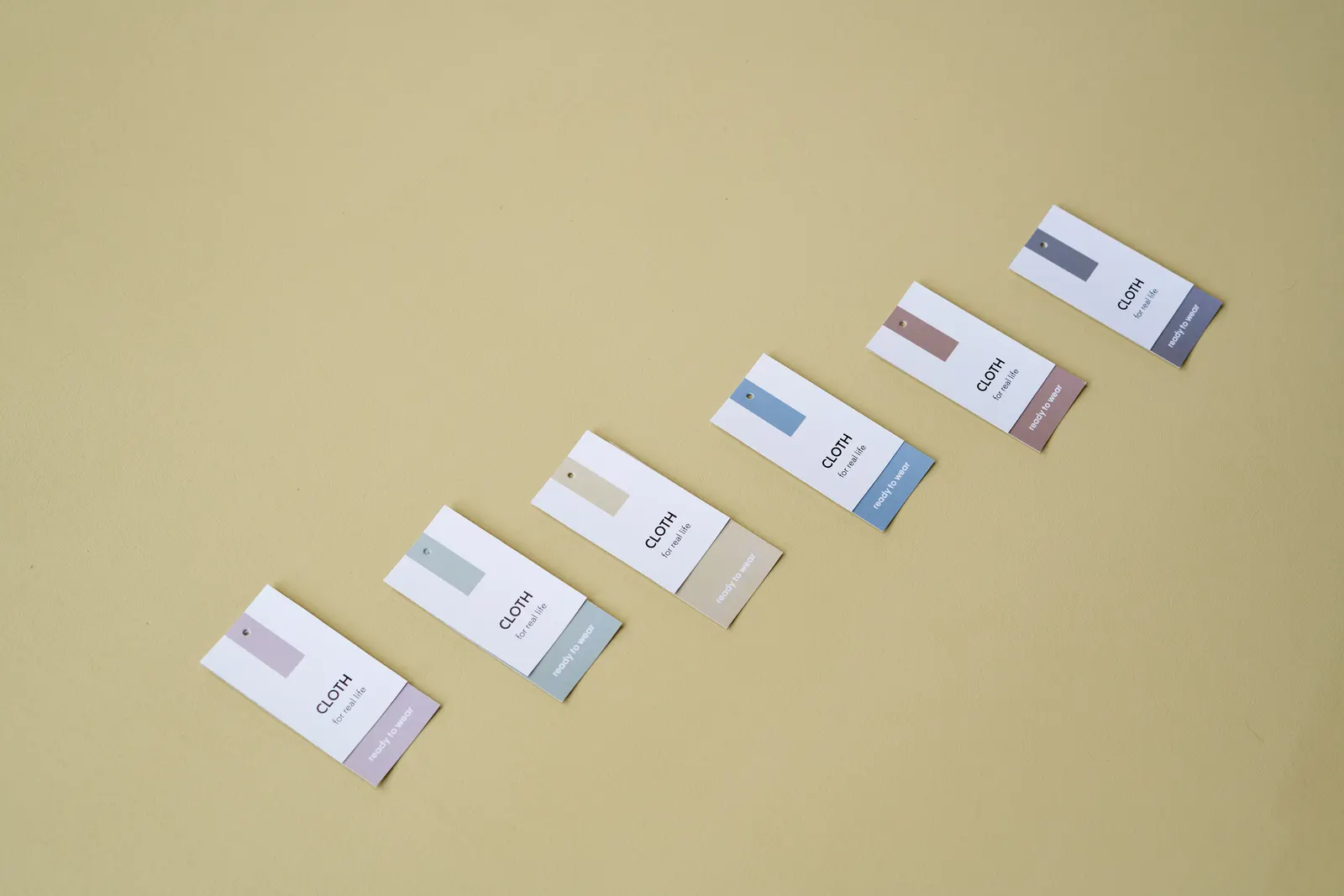
A brand identity redesign is not a matter of taste but of coherence: when your image no longer tells the story of what you have become, it costs you opportunities without your seeing it. For an SME in French-speaking Switzerland, the right moment is neither “never” nor “because the logo is ten years old”. This article helps you recognise the real signals and frame a redesign that strengthens your brand capital instead of erasing it.
The subject is tricky, because it mixes two opposing logics. On one side, internal weariness: from seeing your own logo so often, you find it dated long before the market does. On the other, attachment: you hesitate to touch an image built over years. The right decision is taken neither out of boredom nor out of sentimentality, but by looking coldly at what your brand says, and what it should say.
Brand identity redesign: the unmistakable signals
A redesign is justified when a real gap has opened between what you are and what your image projects. Several objective signals should alert you.
The most important one: a gap between your current offering and your image. You have moved upmarket, broadened your services, changed your target clientele, but your visual identity and your messaging have stayed those of your early days. As a result, you attract the wrong prospects and struggle to justify your positioning. The image then holds growth back instead of carrying it.
Second signal: a structuring event. A merger, an acquisition, a new generation taking the helm, a change of business model. These moments often call for a fresh look at the brand, to embody the company’s new reality.
Third signal: an image that damages credibility. A dated logo, materials that are inconsistent from one channel to the next, a site that no longer reflects your level of service. In a French-speaking Swiss market where trust is decided quickly, a neglected image sends the wrong message, especially against well-groomed competitors.
Beware of false signals, though: “it has been ten years” or “I am fed up with our logo” are not reasons. An old but consistent and recognised brand is an asset, not a problem. Redesigning an identity that still works means risking the destruction of value out of sheer weariness.
To tell a genuine signal from a simple urge for change, one simple test: is the gap you feel visible to your clients, or only to you? If your prospects still perceive you correctly, if your image creates no misunderstanding about what you offer, the urgency is not there. If, on the contrary, people regularly attribute to you an activity, a size or a market level that is no longer yours, the mismatch is real and it is costing you. It is that outside view, not your internal feeling, that should trigger the decision. The safest route is to validate it by honestly questioning a few clients and partners, whose feedback is worth more than all the impressions accumulated in meetings.
What a redesign (really) covers
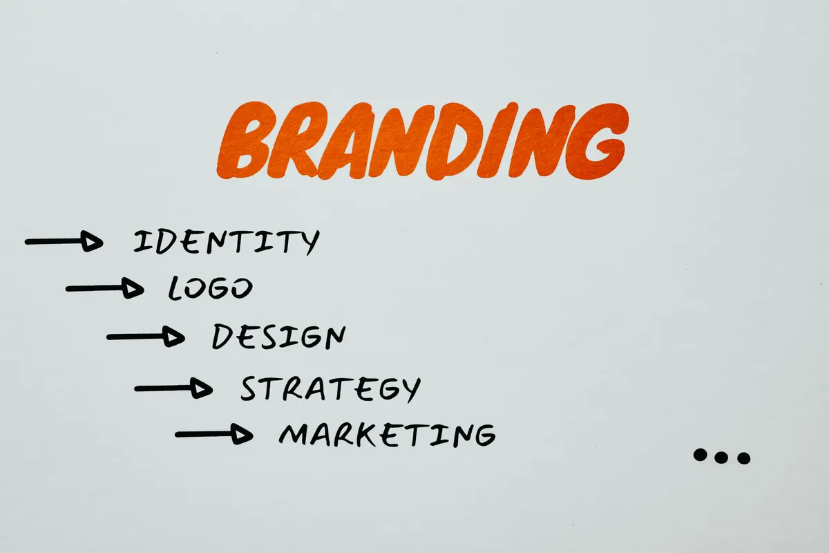 Photo: Eva Bronzini / Pexels
The most common mistake is to reduce a rebrand to a new logo. The logo is only the tip of the iceberg. A genuine brand identity overhaul works on two levels: the visual and the meaning.
Logo, brand guidelines and visual system
The visible part includes the logo, but also the whole graphic system around it: colour palette, typefaces, iconographic style, image treatment, layout rules. It is that system, far more than the logo alone, that creates recognition. A strong brand is immediately identifiable even without its name, because its visual codes are consistent everywhere: website, social media, sales documents, signage.
Coherence is the cardinal value here. A magnificent logo used any old way across disparate materials has less effect than a more modest identity applied with flawless rigour. That is exactly what a visual identity guide is for: making sure the brand speaks with a single visual voice, whatever the touchpoint.
Positioning and message
The invisible part, and often the most decisive, is positioning: what you stand for, for whom, and how you differ. A serious redesign starts by clarifying that before drawing anything. What is your promise? What values do you carry? What tone sets you apart? Those answers then guide every visual and editorial choice.
That is also where memorability is built. A brand that sticks in people’s minds does not do so by chance: it draws on precise cognitive levers, which we explore in our article on the cognitive biases of an unforgettable brand. Redesigning without working on that foundation of meaning is repainting a façade without looking at the foundations.
Rebuilding without destroying your brand capital
The great and legitimate fear around a redesign is losing what has been built: the recognition, the trust, the reference points of your loyal clients. That fear is healthy, because an abrupt redesign really can disorient your clientele and erase years of standing. The key lies in one distinction: evolution or revolution?
In the great majority of cases, an SME is better served by evolution than by a clean break. You modernise, you clarify, you align, but you keep the recognisable elements that are part of your capital. The client has to feel it is still you, only better, not that an unknown company has taken your place. A complete revolution is only justified when the old image has become a genuine handicap or no longer matches the reality of the company at all.
The transition itself has to be managed. A redesign is not rolled out overnight in silence: you explain it, you tell your customers and your teams why the change is happening, you support the switch-over of your materials. That explanatory work turns a risk of confusion into an opportunity to restate who you are. A well-run redesign does not erase your history, it writes the next chapter of it, giving fresh meaning and soul to your presence, as we argue in our article on giving your digital marketing its soul back.
Deciding with clear eyes
Before launching a redesign, ask yourself the only question that matters: what, concretely, must this redesign fix? If the answer is precise (“my image no longer matches our move upmarket”, “since our merger, we speak with two voices”), the project makes sense. If the answer is vague (“we fancy a change”), it is better to wait and invest that money elsewhere.
A successful brand identity redesign is never an aesthetic whim. It is an alignment between what you have become and what the world perceives of you. Properly framed, starting from meaning before the visual, and carried out by evolution rather than by rupture, it strengthens your capital instead of squandering it. Badly framed, it costs a lot for a result that disorients. The whole difference lies in the rigour of the initial diagnosis.
The best way to avoid a hasty decision is still to bring in an outside perspective right from the diagnosis stage. A partner who takes the time to understand your market, your history and your ambitions will tell you frankly whether a brand identity overhaul is justified, or whether your energy would be better invested elsewhere. It is precisely this honest framing, ahead of any creative choice, that separates a profitable redesign from a costly styling exercise with no real effect on your business.
Going further
- Further reading: The cognitive biases behind an unforgettable brand
- To read: Beyond clicks: giving your digital marketing a soul again
Has your image kept pace with how you have grown? Discover our branding offering or let’s talk about your brand.